Recently a reader left a comment on this blog mentioning his cool blog post in which he mapped the spread of a migratory bird using Twitter. His data source was the Waxwings UK account which reports sightings of Bohemian waxwings in the UK. I decided to try reproducing and extending his work using the rOpenSci spocc package that interfaces different sources of species occurrence data.
Getting the occurrence data
As mentioned above I got the data via spocc. I read the README of the Github repo and learnt that it’s called spocc like species occurrence data. So now I should never forget how many “c” there are in the word occurrence. Now please send help for my remembering it has two “r”.
The spocc package interacts with so many data sources that I felt a bit overwhelmed. I guess ecologists are not often blessed with so much data. Note that I don’t limit my query to the UK. Indeed, since seeing this map my interest for the Bohemian waxwing became global. I even decided to get data for the two other species of waxwings, although it only worked for the Bohemian and Cedar waxwings in the end.
I decided to use only data from GBIF. You’ll find more information about GBIF for instance, and other data sources for species occurrences, in this blog post from rOpenSci blog. Since I wanted to get data for different years and all 3 species of waxwings, which meant a lot of data so for getting it I sliced the Earth (I like how evil this sentence makes me sound, ah!). Note that I used overlapping slices because otherwise I didn’t get data at the limits between slices. I guess I could have made my slices slightly less overlapping though.
library("spocc")
library("dplyr")
library("purrr")
library("scrubr")
get_slice <- function(longitude, year){
  print(paste(year, longitude))
  gbifopts <- list(limit = 200000,
                   year = year)
  waxwings <- occ(query = "Bombycilla",
                  from = c('gbif'),
                  gbifopts = gbifopts,
                  geometry = c(longitude - 0.5, - 90,
                               longitude + 0.5, 90))
  waxwings <- occ2df(waxwings)
}
longitudes <- seq( -180, 179, by = 0.5)
years <- rep(2011:2016, length(lo ngitudes))
longitudes <- rep(longitudes,  6)
waxwings <- map2(longitudes, years, get_slice)
for (i in 1:length(waxwings)){
  waxwings[[i]]$latitude <- as.numeric(waxwings[[i]]$latitude)
  waxwings[[i]]$longitude <- as.numeric(waxwings[[i]]$longitude)
}

waxwings <- bind_rows(waxwings)
waxwings <- unique(waxwings)

waxwings <- filter(waxwings, !is.na(name))
readr::write_csv(waxwings, path = "uncleaned_waxwings.csv")
Cleaning the occurrence data
Now because my MSc of ecology is far behind me (but still close to my heart!) I have no idea how to assess the quality of species occurrence data. And even if I did I would have been delighted by the discovery of another rOpenSci package, scrubr, whose aim is to clean species occurrence records. Because I had so much data, I cleaned each day separately, otherwise it was just too long and hard on my poor computer. Don’t start thinking scrubr is slow, it isn’t and it’s getting faster by the minute thanks to work by its maintainer.
cleanup <- function(df){
  print(df$date[1])
  df <- df %>%
    coord_impossible() %>%
    coord_incomplete() %>%
    coord_unlikely()

    if(nrow(df) > 1){

      df <- dedup(df)
    }
  df <- df %>%
    date_standardize("%Y-%m-%d") %>%
    date_missing()
    return(df)
}
waxwings <- readr::read_csv("uncleaned_waxwings.csv")


waxwings <- split(waxwings,
                  waxwings$date)

waxwings <- lapply(waxwings, cleanup)

waxwings <- bind_rows(waxwings)
waxwings <- unique(waxwings)
waxwings <- dplyr::filter(waxwings, name != "Bombycilla japonica",
                   longitude < 50)
readr::write_csv(waxwings, path = "waxwings.csv")
I removed the records with impossible, incomplete or unlikely coordinates (unlikely being e.g. a political centroid, impossible coordinates with a too high longitude), I also removed duplicate records and records without a data. This was so easy! I’d like the scrubr package to come clean my flat, as a team with the janitor package. Now, in real life, I’d probably be even stricter with data cleaning but for the scope of this blog post, using that package without any additionnal check was enough.
I also removed occurrences of the Japanese waxwing because they were too few of them, and occurrences with a longitude higher than 50 because it seemed weird to have non Japanese waxwings in Asia. After all this glorious data cleaning, I had 1015603 records.
Exploring the data
Let the fun begin!
Number of occurrences by species over time
library("ggplot2")
library("hrbrthemes")
library("dplyr")
library("lubridate")
waxwings <- mutate(waxwings,
                   week = update(date, wday = 1))
waxwings %>%
  group_by(week, name) %>%
  summarize(n = n()) %>%
  ggplot() +
  geom_point(aes(week, n)) +
  facet_grid(name ~ ., scales = "free_y") +
   theme(strip.text.y = element_text(angle = 0, size = 6)) +
  xlab("Time (weeks)") +
  ylab("No. of occurrences")

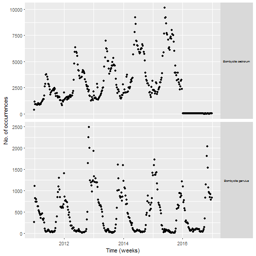
I have no idea why I have no data in 2016 for one of the two species. I decided to not investigate it further since I had enough birds for my primary goal which was mapping migration. The number of occurrences of Cedar waxwing increases over time before 2016, maybe because of more birders reporting sightings? For both species there is a clear seasonality, probably because these birds tend to breed in places where less people can observe them as we’ll see later in the post.
Day-of-the-week effects
waxwings <- mutate(waxwings,
                   wday = lubridate::wday(date, label = TRUE))
waxwings %>%
  group_by(update(date, wday = 1), wday) %>%
  summarize(n = n()) %>%
ggplot() +
  geom_boxplot(aes(wday, n))+
  labs(x="Day of the week", y="No. of reported occurrences",
       title="No. of occurrences of waxwings by day-of-the week",
       caption="Data from GBIF accessed via rOpenSci package spocc") +
  theme_ipsum()

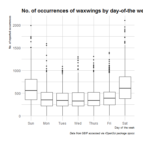
So, more birds are reported on week-ends than on weekdays which I assume is due to a difference in human rather than bird behaviour (but who knows?). Note that for finer characterization of days where more people are birding, I could have used the bizdays package, but then I’d have limited my observations for one country only, because mixing holidays from different countries doesn’t sound like fun. Another thing that might influence sightings, beside people having the day off, might be the weather. For getting weather data in R I can recommend a few packages.
Mapping the migrations!
I first decided to plot the occurrences themselves on maps, by month, and to make a gif out of it. I then had to choose the colour and shape of the points used to represent the birds. Shape? Bird emojis of course! Regarding the colour, I was quite glad when someone I follow on Twitter posted about the birdcolourbot account created by David Lawrence Miller, because I looked and found this tweet with colours for the Bohemian waxwing, Bombycilla garrulus, the one present in both America and Europe. For the Cedar waxwing I had to create a palette myself, which I’d never thought of doing if I hadn’t seen the birdcolourbot account, I’m not a colour artist and often stick to viridis. I used a pretty pic from the internet. In both cases, I uploaded images on this website to get colour codes. A bit of copy-paste work but much easier than having to mix paint colours for real.
bohemian_palette <- c("#1A1A1A", "#878787",
                    "#B15929", "#E21A1C",
                    "#FEFF99")

cedar_palette <- c("#050608", "#5D5C7A",
                   "#AF5F2A", "#8E2F49",
                   "#F3DD31")
To me both species look quite similar so I didn’t expect the palettes to be reallt different. I decided the colours would all have the same probability, instead of weighing them according them to their presence in the usual patterns of each species.
set.seed(1)
library("dplyr")
waxwings <- mutate(waxwings,
                   colour = factor(sample(1:5, size = nrow(waxwings), replace = TRUE)))
waxwings <- mutate(waxwings,
                   month = lubridate::month(date),
                   month_name = lubridate::month(date, label = TRUE, abbr = FALSE))
bohemian <- filter(waxwings,
                   name == "Bombycilla garrulus")


cedar <- filter(waxwings,
                   name == "Bombycilla cedrorum")
After this preparation of the two data.frames I created a function for plotting a month of data for one species. A point I’d like to work on in the future for not being so ashamed of each of my maps are projections.
library("ggalt")
library("magick")
library("ggmap")
library("ggthemes")
library("emojifont")
load.emojifont('OpenSansEmoji.ttf')
wax_map <- map_data("world")
wax_map <- wax_map[wax_map$region != "Antarctica",]

plot_month_species <- function(df, species,
                               name, palette){
  p <- ggplot()
  p <- p + geom_map(data = wax_map,
                    map = wax_map,
                    aes(x = long, y = lat, map_id = region),
                    color = "white", fill = "#7f7f7f",
                    size = 0.05, alpha = 1/4)
  p <- p + theme_map()
  p <- p + geom_text(aes(longitude, latitude,
                col = colour),
                label = emoji("bird"),
                      data = df,
            family="OpenSansEmoji",
                      size = 5)
  p <- p + scale_colour_manual(values = palette)
  p <- p + ylim(min(species$latitude),
                max(species$latitude))
  p <- p + xlim(min(species$longitude),
                max(species$longitude))
  p <- p + theme(legend.position = "none")
  outfil <- paste0("fig_waxwings/", name, "_", df$month[1], ".png")
  ggsave(outfil, p, width=5, height=5)
  image_read(outfil) %>%
    image_annotate(text = as.character(df$month_name[1]),
                   size = 100) %>%
    image_write(outfil)
  outfil

}
I chose to annotate the graph after creating it in order not to have to use the emoji font for the month name.
I first applied the function to the Bohemian waxwings.
bohemian_l <- split(bohemian, bohemian$month)


bohemian_l %>%
  purrr::map(plot_month_species, species = bohemian, name = "bohemian", palette = bohemian_palette) %>%
  purrr::map(image_read) %>%
  image_join() %>%
  image_animate(fps=1) %>%
  image_write("bohemian.gif")

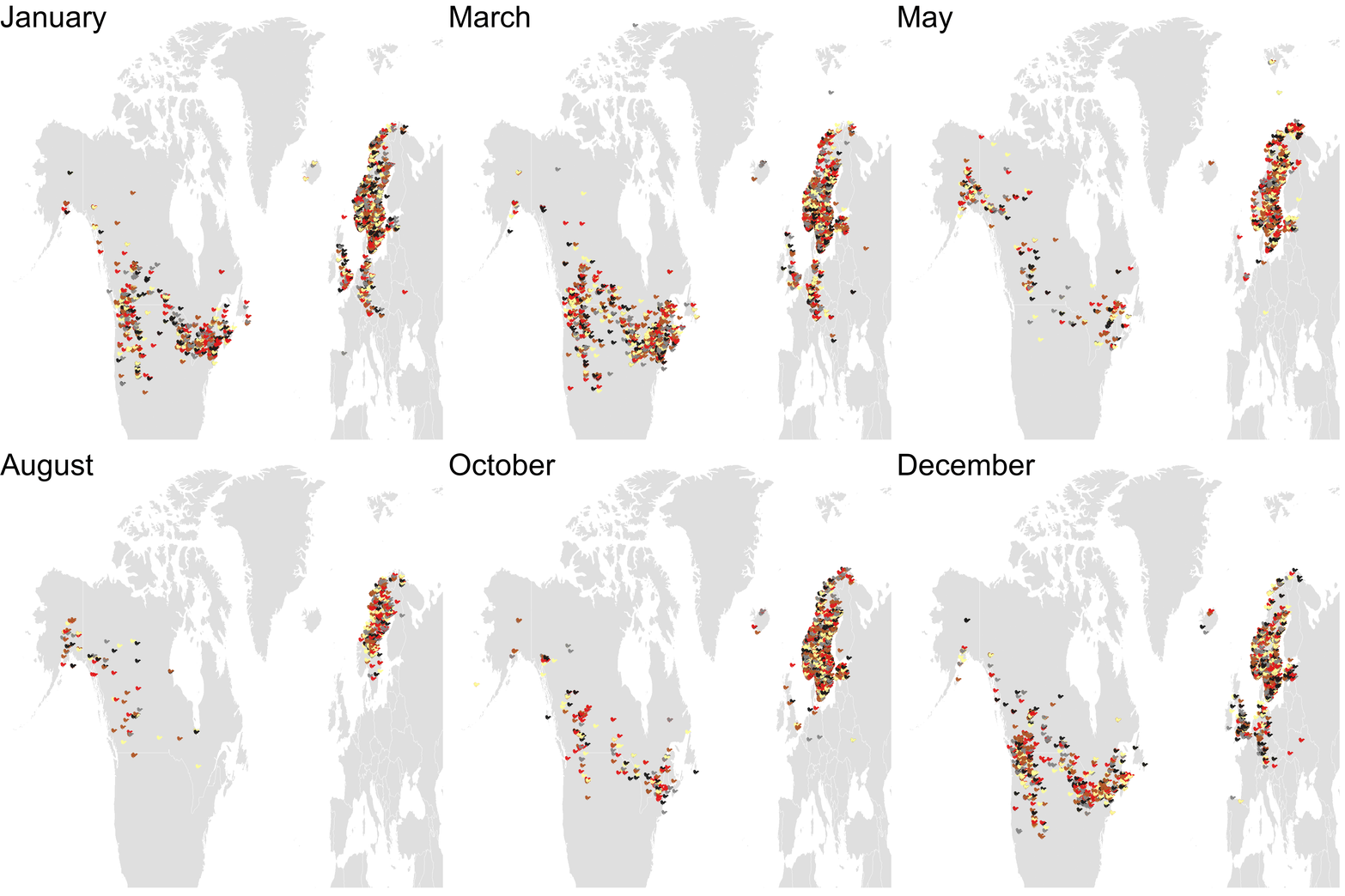
First observation: I think the colours are pretty, but I also think I’ve just invented the concept of a confetti map and I’m not sure I’m proud of that. Then, regarding the underlying bird movements, Bohemian waxwings breed in the spring in regions farther up North than the regions where they winter and this can be seen on the map. There seem to be less sightings in the breeding season, probably because less people live up there, and apparently Santa’s helpers don’t even help.
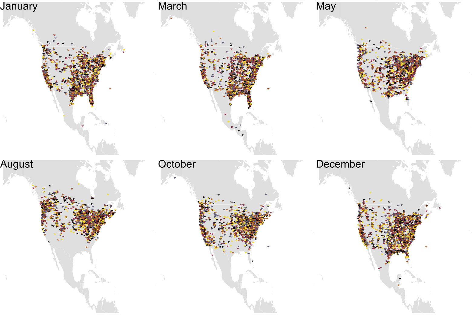
Then it was the turn of the Cedar waxwing for which I had many more observations (871310 vs. 144293). Brace yourself for many confetti!
cedar_l <- split(cedar, cedar$month)


cedar_l %>%
  purrr::map(plot_month_species, species = cedar, name = "cedar", palette = cedar_palette) %>%
  purrr::map(image_read) %>%
  image_join() %>%
  image_animate(fps=1) %>%
  image_write("cedar.gif")

I’ve had a lot of fun making my confetti gifs. I could extend the analysis by using spatial smoothing to draw the zone where waxwings are mostly seen each month. I think the general pattern is clear enough now, but there are some outliers like one Bohemian waxwing in Spain. If there really is a Bohemian waxwing in Spain I’d appreciate its visiting me because I’ve never seen a waxwing!
Concluding
I was impressed by rOpenSci tools for getting and cleaning occurrence data, and quite thankful for the species occurrence data provided by GBIF. I liked plotting migration thanks to species occurrence, although I guess the best method for knowing migration patterns is tracking birds. But then I’ll let professionals do this and keep my bird migration confetti map making as a nice hobby.