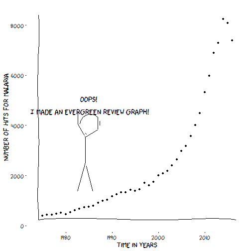
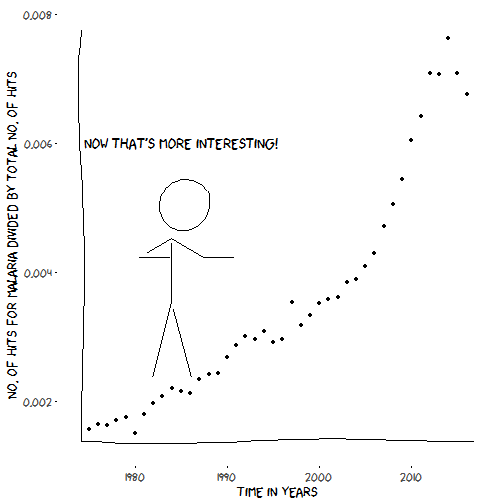
In this post I am inspired by two tweets, mainly this one and also this one. Since the total number of articles every year is increasing, no matter which subject you choose, the curve representing number of articles as a function of year of publication will probably look exponential, so one should not use such graphs to impress readers. At least I’m not impressed, I’m more amused by such graphs now that there’s a hashtag for them.
I shall use an rOpenSci package for getting some data about number of articles about a query term, and to do a graph that’s not an evergreen review graph!
Getting some numbers of articles
For this I’ll use one of the numerous rOpenSci packages simplifying your programmatic access to scientific literature, europepmc which is an interface to Europe PMC, “Search worldwide, life-sciences literature”. The package includes a cool function called epmc_profile that gives you the number of hits for a given query. Perfect!
Now my goal is to get the number of hits by year for a search term but also the total number of hits in order to put things into perspective. I had no idea how to write a proper Europe PMC query so I went to the advanced search page and made queries there in order to learn enough words of this language to get what I needed. Indeed, when you create a query by clicking there and then hit search, the URL contains the query as you need it to be written for using the europepmc package.
For each query epmc_profile returns hits by source and type, but I’m interested in all hits, including e.g. books, so that’s what I’ll use.
Let’s write functions!
library("europepmc")
find_hits <- function(query_term){
  years <- 1975:2016
  results <- purrr::map(years, find_hits_by_year, query_term = query_term)
  dplyr::bind_rows(results)
}

find_hits_by_year <- function(year, query_term){
  queryforall <- paste0('(FIRST_PDATE:[', year, '-01-01+TO+', year, '-12-31])')
  all_hits <- as.numeric(epmc_profile(queryforall)$pubType[1, 2])

  queryforterm <- paste0('(FIRST_PDATE:[', year, '-01-01+TO+', year, '-12-31]) AND "', query_term, '"')

  term_hits <- as.numeric(epmc_profile(queryforterm)$pubType[1, 2])

  return(tibble::tibble(year = year, all_hits = all_hits, term_hits = term_hits))

}
Now let’s apply the function to one term. I’ll choose Malaria because it’s the term used in one of europepmc examples.
malaria_fame <- find_hits("malaria")
library("magrittr")
head(malaria_fame) %>%
  knitr::kable()
| year | all_hits | term_hits |
|---|---|---|
| 1975 | 252386 | 394 |
| 1976 | 259044 | 425 |
| 1977 | 266538 | 432 |
| 1978 | 279160 | 475 |
| 1979 | 294491 | 516 |
| 1980 | 295471 | 443 |
Obviously in a review about malaria research one might have a more precise query, and one might want to compare the number of hits for that query to other precise queries, but in this simple example I’m just comparing the number of hits of one term to the number of all hits, Note that one could also make no graph about number of hits over time, shocking I now! I’ll most certainly won’t do no graph here though, now that I collected the data.
Making nice plots
I’ll do as Lucy in this blog post and use the xkcd package. As noted by Lucy, its vignette is great. I might have done something wrong but after downloading the file with the xkcd font I had to copy-paste it myself in the fonts folder of Windows. The syntax of the xkcdman is a bit long but following the examples I could get what I wanted.
library("xkcd")
library("ggplot2")
library("extrafont")
xrange <- range(malaria_fame$year)
yrange <- range(malaria_fame$term_hits)
ratioxy <- diff(xrange)/diff(yrange)
mapping <- aes(x=x,
               y=y,
               scale=scale,
               ratioxy=ratioxy,
               angleofspine = angleofspine,
               anglerighthumerus = anglerighthumerus,
               anglelefthumerus = anglelefthumerus,
               anglerightradius = anglerightradius,
               angleleftradius = angleleftradius,
               anglerightleg =  anglerightleg,
               angleleftleg = angleleftleg,
               angleofneck = angleofneck)
dataman <- data.frame(x = 1985, y = 4000,
                  scale = 1000,
                  ratioxy = ratioxy,
                  angleofspine =  - pi / 2,
                  anglerighthumerus = 4*pi/6,
                  anglelefthumerus = pi/6,
                  anglerightradius = pi/2,
                  angleleftradius = pi/2,
                  angleleftleg = 3*pi/2  + pi / 12 ,
                  anglerightleg = 3*pi/2  - pi / 12,
                  angleofneck =  3 * pi / 2 - pi/10)

ggplot(malaria_fame) +
  geom_point(aes(year, term_hits)) +
  xlab("Time in years") +
  ylab("Number of hits for Malaria") +
  xkcdaxis(xrange = xrange,
           yrange = yrange) +
  theme(text = element_text(size = 16, family = "xkcd")) +
  xkcdman(mapping,dataman) +
  annotate("text", family = "xkcd", x = 1985, y = 4800,
           label = "Oops!\n I made an evergreen review graph!", size = 6)

Ok that one is not really the one I’d advise you to submit to any journal. Let’s do better.
malaria_fame <- dplyr::mutate(malaria_fame,
                              prop = term_hits/all_hits)
xrange <- range(malaria_fame$year)
yrange <- range(malaria_fame$prop)
ratioxy <- diff(xrange)/diff(yrange)

dataman <- data.frame(x = 1985, y = 0.005,
                  scale = 0.001,
                  ratioxy = ratioxy,
                  angleofspine =  - pi / 2,
                  anglerighthumerus = -pi/6,
                  anglelefthumerus = pi + pi/6,
                  anglerightradius = 0,
                  angleleftradius = 0,
                  angleleftleg = 3*pi/2  + pi / 12 ,
                  anglerightleg = 3*pi/2  - pi / 12,
                  angleofneck =  3 * pi / 2 - pi/10)

ggplot(malaria_fame) +
  geom_point(aes(year, prop)) +
  xlab("Time in years") +
  ylab("No. of hits for Malaria divided by total no. of hits") +
  xkcdaxis(xrange = xrange,
           yrange = yrange) +
  theme(text = element_text(size = 16, family = "xkcd")) +
  xkcdman(mapping,dataman) +
  annotate("text", family = "xkcd", x = 1985, y = 0.006,
           label = "Now that's more interesting!", size = 6)

Okay friends so that one is a bit more interesting, and I’m more convinced my its shape. I’d like to know whether there really was a malaria research peak, but only waiting for a few years will bring me the answer! It’d also be interesting to compare the fate of other diseases, and to put that in context with some domain knowledge. But that’d be a subject for another study, now at least you know how to not make an evergreen review graph!