It’s the second time I write a post about the blog aggregator R-bloggers, probably because I’m all about R blogs now that I have one. My husband says my posts are so meta. My first post was about R blogs names, in this one I shall focus on the last 1,000 tweets from R-bloggers.
Getting the tweets
Thanks to rtweet, this is fairly easy. I get rid of empty columns using janitor, which is a package you should really check out if you ever have to clean data.
library("rtweet")
rbloggers <- get_timeline(user = "Rbloggers",
                          n = 1000)

rbloggers <- janitor::remove_empty_cols(rbloggers)

readr::write_csv(rbloggers, path = "data/2017-02-28-rbloggerstweets.csv")

knitr::kable(head(rbloggers))
| created_at | status_id | text | source | is_quote_status | retweet_count | favorite_count | lang | user_id | screen_name | mentions_user_id | mentions_screen_name | hashtags | urls | is_retweet |
|---|---|---|---|---|---|---|---|---|---|---|---|---|---|---|
| 2017-02-28 20:00:42 | 836667465333673984 | How to annotate a plot in ggplot2 https://t.co/78h18Plc5e #rstats #DataScience | r-bloggers.com | FALSE | 12 | 17 | en | 144592995 | Rbloggers | NA | NA | rstats,DataScience | https://wp.me/pMm6L-Crh | FALSE |
| 2017-02-28 17:00:40 | 836622157295857665 | How to create correlation network plots with corrr and ggraph (and which countries drink like https://t.co/K8g1OkvWMs #rstats #DataScience | r-bloggers.com | FALSE | 14 | 55 | en | 144592995 | Rbloggers | NA | NA | rstats,DataScience | https://wp.me/pMm6L-Cre | FALSE |
| 2017-02-28 16:11:45 | 836609848276037636 | forecast 8.0 https://t.co/XATCVdeoJ8 #rstats #DataScience | r-bloggers.com | FALSE | 15 | 38 | en | 144592995 | Rbloggers | NA | NA | rstats,DataScience | https://wp.me/pMm6L-Crc | FALSE |
| 2017-02-28 15:18:28 | 836596435307081729 | New R job: Applied Research Statistician/Methodologist https://t.co/Hfkanf74aM #rstats #DataScience #jobs | r-bloggers.com | FALSE | 2 | 7 | en | 144592995 | Rbloggers | NA | NA | rstats,DataScience,jobs | https://www.r-users.com/jobs/applied-research-statisticianmethodologist/ | FALSE |
| 2017-02-28 13:12:59 | 836564859647033344 | [WEBINAR] Trading in Live Markets using R https://t.co/nNGyQOqUmw #rstats #DataScience | r-bloggers.com | FALSE | 5 | 21 | en | 144592995 | Rbloggers | NA | NA | rstats,DataScience | https://wp.me/pMm6L-Cra | FALSE |
| 2017-02-28 00:40:34 | 836375506945716226 | Video Introduction to Bayesian Data Analysis, Part 2: Why use Bayes? https://t.co/fmHtKr99kw #rstats #DataScience | r-bloggers.com | FALSE | 49 | 101 | en | 144592995 | Rbloggers | NA | NA | rstats,DataScience | https://wp.me/pMm6L-CqZ | FALSE |
Now that I have the data, I’ll have a look at the content of the tweet, at their temporal patterns and at their popularity.
What are the most frequent words?
For finding the most frequent words in the tweets I use what has now become my usual workflow with tidytext. I remove 4 words that correspond to the hashtags used in every tweet (#rstats and #datascience) and to links (https and t.co)
rbloggers <- readr::read_csv("data/2017-02-28-rbloggerstweets.csv")
library("tidytext")
library("dplyr")
library("rcorpora")
library("lubridate")
library("ggplot2")
library("viridis")
stopwords <- corpora("words/stopwords/en")$stopWords

rbloggers_words <- rbloggers %>%
  unnest_tokens(word, text) %>%
  count(word, sort = TRUE) %>%
filter(!word %in% stopwords) %>%
  filter(!word %in% c("rstats", "datascience",
                      "t.co", "https"))
knitr::kable(head(rbloggers_words, n = 20))
| word | n |
|---|---|
| data | 171 |
| analysis | 62 |
| jobs | 48 |
| package | 46 |
| job | 41 |
| 2 | 36 |
| shiny | 33 |
| science | 28 |
| 1 | 27 |
| 2017 | 26 |
| regression | 22 |
| learning | 20 |
| scientist | 19 |
| app | 18 |
| map | 18 |
| ggplot2 | 17 |
| interactive | 17 |
| rstudio | 17 |
| statistics | 17 |
| model | 16 |
I’m not surprised by the trendy words, I guess you could mix a few of them up and get a pretty cool title, e.g. “How to make an app in RStudio with an interactive map in it” or “let’s analyse data with a regression and plot everything with ggplot2”. I think I’m more surprised that in 1,000 tweets, no word is that predominant.
When are blog posts published?
I’ll start with a warning, R-bloggers tweets appear a bit after the actual blog posts are published, about a few hours I’d say. I actually need a second warning, regarding time of day we have to keep in mind R blogs can be written from everywhere on the planet so in theory R-bloggers is an account that never sleeps.
rbloggers <- mutate(rbloggers, wday = as.factor(wday(created_at, label = TRUE)))
rbloggers <- mutate(rbloggers, hour = as.factor(hour(created_at)))
rbloggers <- mutate(rbloggers, week = week(created_at))
rbloggers <- mutate(rbloggers, day = as.Date(created_at))
Note that the reason I can use week is that there are no tweets from more than one year ago in my data.
Here I’ll show the number of tweets by day of the week.
weekday_dat <- rbloggers %>%
  group_by(week, wday) %>%
  summarize(n = n(), created_at = created_at[1])

arrange(weekday_dat, desc(n)) %>%
  head() %>%
  knitr::kable()
| week | wday | n | created_at |
|---|---|---|---|
| 4 | Sun | 98 | 2017-01-22 23:50:19 |
| 4 | Mon | 82 | 2017-01-23 23:10:18 |
| 3 | Sat | 65 | 2017-01-21 23:52:03 |
| 4 | Wed | 34 | 2017-01-25 22:10:27 |
| 4 | Fri | 19 | 2017-01-27 23:40:37 |
| 6 | Tues | 19 | 2017-02-07 23:50:44 |
There are a few days with a lot of tweets, which I guess is due to one blog being added and all its posts being shared at once? In any case, I’ll remove these days from the figure by not showing outliers.
ggplot(weekday_dat) +
  geom_boxplot(aes(wday, n),
               outlier.shape = NA) +
  scale_y_continuous(limits =  quantile(weekday_dat$n, c(0, 0.9)))
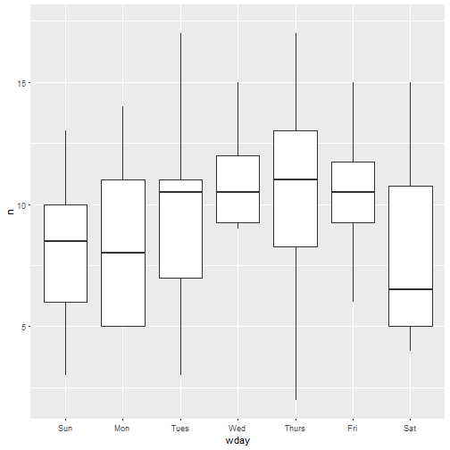
I’m not too sure what to conclude as regards a possible day-of-the-week pattern. Maybe I’d need more data, since I don’t even have a full year of data:
min(rbloggers$created_at)
## [1] "2016-12-14 19:06:23 UTC"
max(rbloggers$created_at)
## [1] "2017-02-28 20:00:42 UTC"
With more data maybe I could say whether R-bloggers, who I think are often not blogging for work, post more on the week-ends. Thinking of programming, week-ends and weekdays makes me think of this very good post of Julia Silge’s. Similarly for hour of the day (results not shown) I’m a victim, I think, of the size of my dataset. Moreover, even with a bigger sample, I’d still have trouble finding a circadian rythm since it’d mix tweets from several timezones, without any information about the location of the blog author. Too bad! And with years of data I could even look at seasonality!
How popular are R-bloggers tweets?
I’ll be honest, this is the primary reason why I got interested into R-bloggers’ feed. I wondered how famous it made my poor young blog. Well if I have to be honest I also wondered how visible an error of mine would be.
ggplot(rbloggers) +
  geom_histogram(aes(favorite_count))
ggplot(rbloggers) +
  geom_histogram(aes(retweet_count))
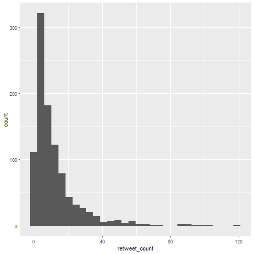
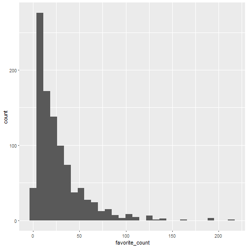
Both look like negative binomial distributions, right? But I don’t want to model them, I’m in a minimalistic mood. Note that the median number of retweet is 8 and the median number of favorites is 19. Let’s see which were the most popular tweets.
arrange(rbloggers, desc(retweet_count)) %>%
  head() %>%
  knitr::kable()
| created_at | status_id | text | source | is_quote_status | retweet_count | favorite_count | lang | user_id | screen_name | mentions_user_id | mentions_screen_name | hashtags | urls | is_retweet | wday | hour | week | day |
|---|---|---|---|---|---|---|---|---|---|---|---|---|---|---|---|---|---|---|
| 2016-12-29 08:02:09 | 8.143810e+17 | 7 Visualizations You Should Learn in R https://t.co/p7aww3ueiU #rstats #DataScience | r-bloggers.com | FALSE | 119 | 214 | en | 144592995 | Rbloggers | NA | NA | rstats,DataScience | https://wp.me/pMm6L-BEP | FALSE | Thurs | 8 | 52 | 2016-12-29 |
| 2017-01-03 17:42:14 | 8.163389e+17 | Why R is the best data science language to learn today https://t.co/Bp5XouKIZ9 #rstats #DataScience | r-bloggers.com | FALSE | 101 | 129 | en | 144592995 | Rbloggers | NA | NA | rstats,DataScience | https://wp.me/pMm6L-BGQ | FALSE | Tues | 17 | 1 | 2017-01-03 |
| 2017-01-25 03:10:20 | 8.240920e+17 | Free guide to text mining with R https://t.co/o8pkSA3Rke #rstats #DataScience | r-bloggers.com | FALSE | 99 | 191 | en | 144592995 | Rbloggers | NA | NA | rstats,DataScience | https://wp.me/pMm6L-C1p | FALSE | Wed | 3 | 4 | 2017-01-25 |
| 2017-02-24 10:50:47 | 8.350795e+17 | Announcing ggraph: A grammar of graphics for relational data https://t.co/5jKGoK6Dsu #rstats #DataScience | r-bloggers.com | FALSE | 94 | 141 | en | 144592995 | Rbloggers | NA | NA | rstats,DataScience | https://wp.me/pMm6L-Cpx | FALSE | Fri | 10 | 8 | 2017-02-24 |
| 2017-02-07 03:50:39 | 8.288132e+17 | Deep Learning in R https://t.co/HTHKDy7mnN #rstats #DataScience | r-bloggers.com | FALSE | 92 | 189 | en | 144592995 | Rbloggers | NA | NA | rstats,DataScience | https://wp.me/pMm6L-Cer | FALSE | Tues | 3 | 6 | 2017-02-07 |
| 2017-01-28 12:10:33 | 8.253151e+17 | The “Ten Simple Rules for Reproducible Computational Research” are easy to reach for R users https://t.co/9hsKE2FgHt #rstats #DataScience | r-bloggers.com | FALSE | 91 | 122 | en | 144592995 | Rbloggers | NA | NA | rstats,DataScience | https://wp.me/pMm6L-C6O | FALSE | Sat | 12 | 4 | 2017-01-28 |
I’m happy to report I’d heard of most of these posts. I feel so well informed.
Now I guessed that the number of retweets and favorites were correlated, so I decided to draw a scatterplot which according to one of the posts above is a visualization you should learn.
ggplot(rbloggers) +
geom_point(aes(retweet_count, favorite_count))
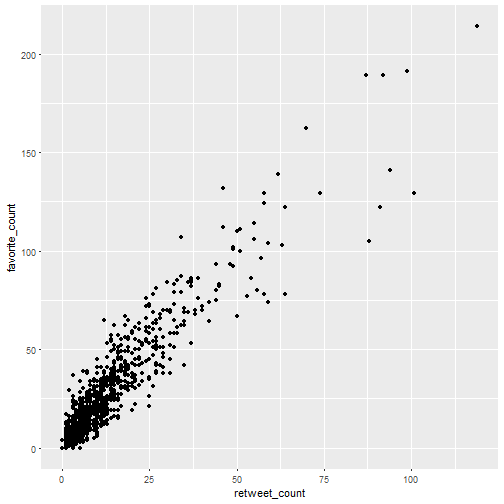
Wow! I was so surprised by this plot that I decided to make the same for another R content aggregator account, R Weekly.
rweekly_org <- get_timeline(user = "rweekly_org",
                          n = 1000)

ggplot(rweekly_org) +
geom_point(aes(retweet_count, favorite_count)) +
  ggtitle("rweekly_org's timeline")
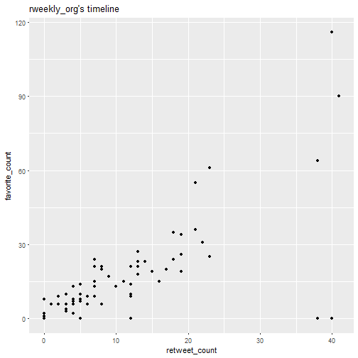
Well here we have far less tweets sadly. I still think there might be a golden ratio of some sort hidden here, so I’ll fit linear models to both datasets.
model <- lm(favorite_count ~ retweet_count, data = rbloggers)
broom::tidy(model) %>% knitr::kable()
| term | estimate | std.error | statistic | p.value |
|---|---|---|---|---|
| (Intercept) | 4.945224 | 0.4105901 | 12.04419 | 0 |
| retweet_count | 1.779315 | 0.0223167 | 79.73038 | 0 |
model2 <- lm(favorite_count ~ retweet_count, data = rweekly_org)
broom::tidy(model2) %>% knitr::kable()
| term | estimate | std.error | statistic | p.value |
|---|---|---|---|---|
| (Intercept) | 2.118446 | 2.7470733 | 0.7711648 | 0.4434471 |
| retweet_count | 1.382438 | 0.1783162 | 7.7527315 | 0.0000000 |
Now I just hope that if we collected more data for both accounts, the second coefficient estimate would be close to the golden ratio, about 1.618. Or I could let social media specialists explain me why retweets and favorites have this correlation. Or where the mistake in my post is, which I’d like to know before it gets sort of viral thanks to R-bloggers.