You might have heard of the “bar bar plots” movement whose goal is to prevent using (let’s use ggplot2 language shall we) geom_bar when you could have used e.g. geom_boxplot or geom_histogram because the bar plot hides the variability of the distributions you say you’re comparing, even if you add some sort of error bar. I whole-heartedly agree with this movement but in this post I’d like to present some ok bar plots, that represent counts of individuals in different categories. You might know them as geom_bar(blabla, stat = "identity") or geom_col. They’re still bar plots and they’re great, in particular when you make puns out of them which is what I did with Miles McBain.
The reason I mentioned bar plots to Miles was my wanting to recycle some old code of mine (again) for a blog post. It was code from my “let’s test all the kitsch R plots have to offer” period, when I had started using Thomas Leeper’s colourlovers package for adding patterns on bars.
colourlovers is a great package for getting trendy colour palettes, although I’ll admit I’m a viridis person. But colourlovers also has patterns, about which the package documentation states “Patterns are images created on COLOURlovers using a specified palette of colors. They serve as examples of how to use the palette in practice.”. At the time I read those sentences I got really excited because I was convinced one could do more with patterns, like filling bar plots with them. In this post, I’ll prove you can, with my non-generalizable worflow.
library("dplyr")
library("tidyr")
library("httr")
library("grid")
library("ggplot2")
library("colourlovers")
General comments on using patterns
A pattern is a square image that I convert to a raster. This raster is a matrix with 200 rows and 200 columns. In this matrix $x_{i,j}$ represents the hex code of the colour of a pixel. Below I show how to get a pattern figure and how to plot it on its own.
# get pattern
catsBlue <- clpattern(id = "3363032")
# get the URL of the picture corresponding to the pattern
imageURL <- catsBlue$imageUrl
# get the picture
 picture <-  content(GET(as.character(imageURL)))
# convert it to a raster
img <- as.raster(picture)
# plot it!
plot(img)

This pattern can also be seen as a puzzle piece: one can copy the pattern several times and put each copy side by side and/or pile them up and get something that looks homogeneous with no problem at the border of each piece.
In ggplot2, I’ll add the patterns with geom_point. The main issue will be to re-size puzzle pieces (how big should be a single puzzle piece for the graph to look nice?), to paste pieces together (now many puzzle pieces?), and to crop the puzzle (the puzzle should not be bigger than the bar it covers, for instance).
Writing code for decorating a bar plot
Here is the original bar plot I aim to make fancier.
# Normal plot
c <- ggplot(mtcars, aes(factor(cyl)))
c <- c + geom_bar(width = .5,
                  aes(fill = factor(cyl)))+
  theme(text = element_text(size=20))
c
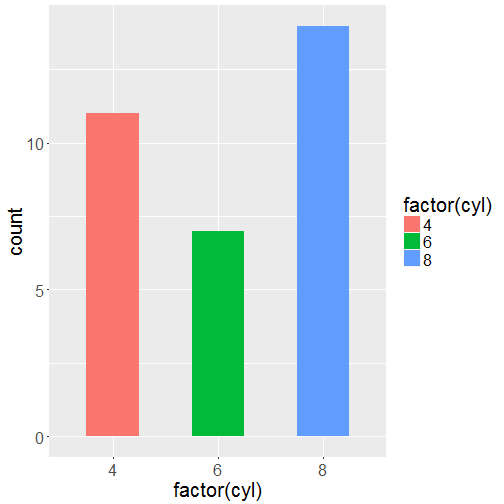
Now, since my puzzle pieces are squares, I want the plot to have a x/y ratio such that the distance between two major grid lines on the x axis is the same as the distance as the distance between two major grid lines on the y axis.
plotInfo <- ggplot_build(c)
extentX <- diff(plotInfo$layout$panel_ranges[[1]]$x.major_source)[1]
extentY <- diff(plotInfo$layout$panel_ranges[[1]]$y.major_source)[1]
c <- c + coord_fixed(ratio = extentX/extentY)
c
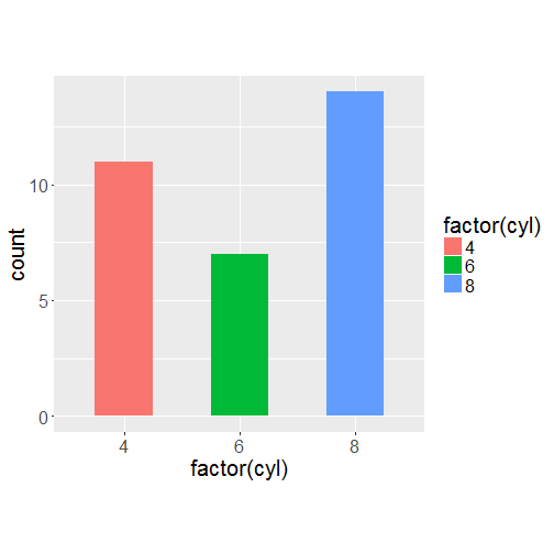
I’ll reckon once again that since writing the code and publishing it I’ve slept many times and thus forgotten how I came up with the solution. Today I had to change the code for getting extentY and extentX a bit since ggplot_build() gives a slightly different output since ggplot2 newest version was released.
I shall now get three patterns from colourlovers. I went on the website of colourlovers itself to find three patterns using the same template with different colours so I know their IDs.
# get the patterns
get_patterns <- function(id_blue, id_red, id_green){
  blue <- clpattern(id = id_blue)
  red <- clpattern(id = id_red)
  green <- clpattern(id = id_green)
  list(red, green, blue)
}

patterns <- get_patterns(id_blue = 4348319,
                         id_red = 4376078,
                         id_green = 4360659)
I shall first get one colour from each pattern and re-do the figure with these colours. I do this to have a legend later. I don’t want to try and reproduce parts of the patterns to get them in the legend.
library("purrr")
get_colors <- function(pattern){
  pattern$colors[3]$hex
}
addhash <- function(color){
  paste0("#", color)
}

colors <- map(patterns, get_colors) %>%
  map(addhash) %>%
  unlist()

c2 <- c + scale_fill_manual(values = colors)
c2
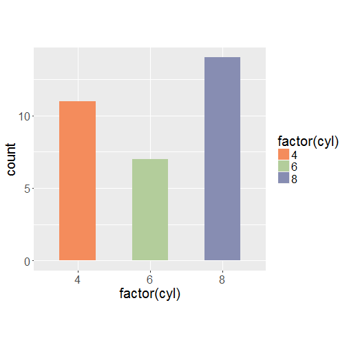
Now let’s add the patterns to the graph! It’s quite inelegant since I use a loop for adding things successively to the graph.
add_patterns <- function(plot, patterns, colors){
  for (i in 1:length(levels(factor(mtcars$cyl)))){
  imageURL <- patterns[[i]]$imageUrl
  # get pattern
  picture <-  content(GET(as.character(imageURL)))
  # picture is a 4 dimensional array
  img <- as.raster(picture)

  # we have to repeat the data.frame/pattern
  # I repeat it so that one extentY = one square
  xmax <- 1
  ymax <- sum(mtcars$cyl == levels(factor(mtcars$cyl))[i])

  size <- ceiling(ymax*2/extentY)

  img2 <- apply(img,MARGIN=2,function(x) rep(x,size))

  # from matrix to data.frame
  img2 <- tbl_df(as.data.frame(as.matrix(img2)))

  # I change the column names so that they correspond to x coordinates
  names(img2) <- seq(i - 0.25, to = i + 0.25, length = ncol(img2))

  # I transform the img2 so that I have one line = 1 x, 1 y and 1 colour
  dataPlot <- img2 %>%
    mutate(y = seq(from = size/2*extentY, to = 0, length = nrow(img2)))%>%
    gather(x, value, 1:ncol(img2)) %>%
    # filter part of the pattern that doesn't fit in the original bar
    filter(y <= ymax)  %>%
    mutate(x = as.numeric(x))


  plot <- plot + geom_point(data = dataPlot, aes(x, y), col = dataPlot$value)
}
plot
}

add_patterns(plot = c2, patterns = patterns, colors = colors) +
  ggtitle("Babar bar plot")
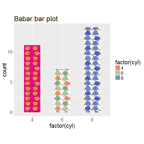
We’ve just made a Babar bar plot! Thanks Miles for this pun. Now let’s apply the same principles again and by principles I mean applying the colourlover code I’ve just presented, and using puns developped with Miles. A recipe for success!
Other punny plots
Barber plot
patterns <- get_patterns(id_blue = 3490878,
                         id_red = 3277163,
                         id_green = 4038034)
colors <- map(patterns, get_colors) %>%
  map(addhash) %>%
  unlist()
c2 <- c + scale_fill_manual(values = colors)

add_patterns(plot = c2, patterns = patterns, colors = colors) +
  ggtitle("Barber bar plot")
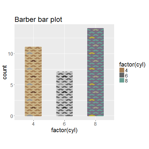 This is one plot decoration you could use to illustrate something about Occam’s razor.
Bark plot
patterns <- get_patterns(id_blue = 1816764,
                         id_red = 1825775,
                         id_green = 1815897)

colors <- map(patterns, get_colors) %>%
  map(addhash) %>%
  unlist()
c2 <- c + scale_fill_manual(values = colors)

add_patterns(plot = c2, patterns = patterns, colors = colors) +
  ggtitle("Bark bar plot")
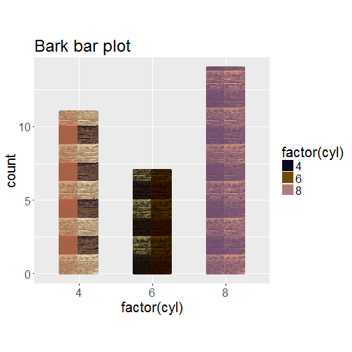
I’m less convinced by this one, maybe it’d have looked better with barking dogs?
BART plot
patterns <- get_patterns(id_blue = 1902711,
                         id_red = 1916712,
                         id_green = 1930435)
colors <- map(patterns, get_colors) %>%
  map(addhash) %>%
  unlist()
c2 <- c + scale_fill_manual(values = colors)

add_patterns(plot = c2, patterns = patterns, colors = colors) +
  ggtitle("BART bar plot")
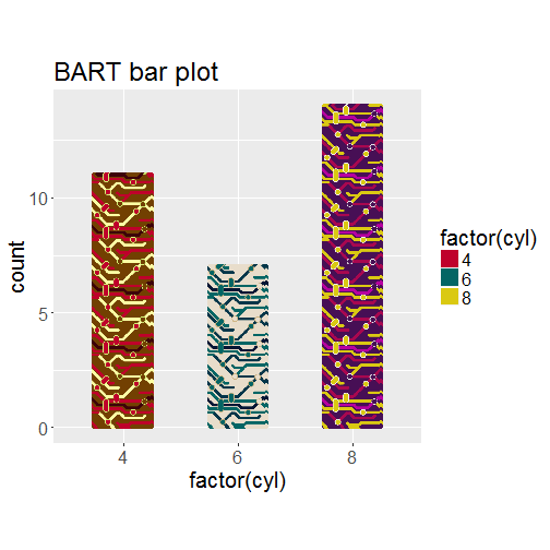
This one is the loudest bar plot you’ll ever make since it was inspired by San Francisco BART. I might have come up with this idea after not finding a Bart Simpson pattern.
I told Miles I’d stop once I’d only think of a barf plot which I don’t want to draw ever. As I had said the first time I made a bar plot with patterns, I’m not sure how useful it is, but you never know when you’re gonna need a fancy plot to get someone’s attention, right?