After exploring my study population of Wikipedia deaths, I want to analyse the time series of monthly counts of notable deaths. This is not a random interest of mine, my PhD thesis was about monitoring time series of count, the application being weekly number of reported cases of various diseases.
Number of deaths reported over time
library("ggplot2")
library("viridis")
library("dplyr")
library("lubridate")
deaths <- readr::read_csv("data/deaths_with_demonyms.csv")
deaths %>%
  group_by(date) %>%
  summarize(n_deaths = n()) %>%
  ggplot(aes(x = date, xend = date,
             y = 0, yend = n_deaths)) +
  geom_segment() +
  xlab("Time (days)") + ylab("Number of reported deaths")
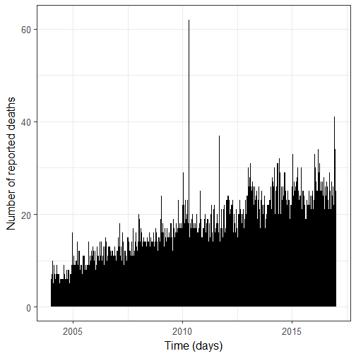
I have two remarks about this figure:
-
There is an increase in the number of reported deaths over time, which is not surprising given the growth of Wikipedia.
-
There are three major peaks. They are due to the 2010 Haiti earthquake of the 12th of January; the 2010 Polish Air Force Tu-154 crash on the 10th of April of 2010; and the 2011 Lokomotiv Yaroslavl air disaster on the 7th of September 2011. In the following, I will remove the fatalities from these events.
Modeling the time series
When I think of modeling time series of count in R, I either think of surveillance, which was the implementational repository of my methodological developments as Michael would say; or of tscount, which was the package of my PhD writing buddy Tobias Liboschik (after meeting at a conference we exchanged feedback on our thesis chapters which was awesome). If you have an interest in prospectively detecting outbreaks and a time series with seasonality, like the time series of number of cases of Salmonella, then surveillance is the best choice. Now in the case of Wikipedia deaths, I felt more inclined towards using tscount. I had never properly used it apart from a comparison section in my thesis so it was also more exciting. So tscount it was!
In tscount, you have tsglm models which take into account both the count nature of the data and its time series nature, i.e. you can treat auto-correlation. The vignette of tscount is a really great manuscript.
I’ll use the time series of monthly counts of deaths in the rest of the post.
library("tscount")
monthly_deaths <- deaths %>%
  group_by(wiki_link) %>%
  mutate(month = update(date, day = 1)) %>%
  ungroup() %>%
  group_by(month) %>%
  summarize(n = n())

haiti_earthquake <- update(ymd("2010-01-12"), day = 1)
aircrash1 <- update(ymd("2010-01-12"), day = 1)
aircrash2 <- update(ymd("2011-09-07"), day = 1)

monthly_deaths <- mutate(monthly_deaths, n = ifelse(month == haiti_earthquake, n - 10, n))
monthly_deaths <- mutate(monthly_deaths, n = ifelse(month == aircrash1, n - 96, n))
monthly_deaths <- mutate(monthly_deaths, n = ifelse(month == aircrash2, n - 44, n))
ggplot(monthly_deaths) +
  geom_segment(aes(x = month, xend = month,
             y = 0, yend = n)) +
  ylab("Number of reported deaths") +
  xlab("Time (months)")
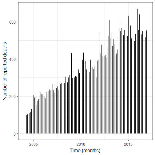
We still see the upward trend, and I have a feeling we’re also dealing with overdispersion. First step before doing any modeling: getting a ts object. I hold off the last 12 months which are 2016 months.
ts_deaths <- xts::xts(monthly_deaths$n[1:144], monthly_deaths$month[1:144])

ts_deaths = ts(ts_deaths, freq=12, start=c(2004, 1))
plot(ts_deaths)
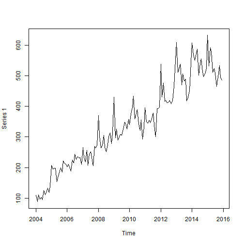
Then I use a model with regression on the past observation, on the mean from one year ago, and with a temporal trend. I log-transform time because the regression model uses a log link and I don’t expect the time trend to be exponential on the response scale. I’ll fit a Poisson and a negative binomial models in order to compare them.
time <- log(1:nrow(monthly_deaths))
fit_pois <- tsglm(ts_deaths[1:144], model = list(past_obs = 1, past_mean = 13), xreg = time[1:144], distr = "poisson")
fit_nb <- tsglm(ts_deaths[1:144], model = list(past_obs = 1, past_mean = 13), xreg = time[1:144], distr = "nbinom")
For choosing between the two models I’ll use scoring rules.
rbind(Poisson = scoring(fit_pois), NegBin = scoring(fit_nb))
##         logarithmic    quadratic  spherical rankprob    dawseb     normsq
## Poisson    10.23428  0.003338134 -0.0495852 40.83497 17.633417 11.8105665
## NegBin      5.68638 -0.004157600 -0.0655695 35.61633  9.417219  0.9722222
##          sqerror
## Poisson 3835.296
## NegBin  3835.296
The smaller the scoring rule the better, so we should use the negative binomial model which I’m happy about since I had assumed we’d be dealing with overdispersion. Note that I used scoring rules whose values were computed on the part of the data I used for fitting the model, which is what Tobias Liboschik did in his manuscript for the Campylobacter example.
Predicting 2016 values
I realized there’s no broom “adapter” for tsglm so I’ll write untidy code and hope you’ll all forgive me.
set.seed(1)
pred2016 <- predict(fit_nb, n.ahead = 12, level = 0.9, global = TRUE, B = 3000, newxreg = time[145:156])
monthly_deaths <- mutate(monthly_deaths, lower = NA,
                         upper = NA, pred = NA)
monthly_deaths$lower[145:156] <- pred2016$interval[,1]
monthly_deaths$upper[145:156] <- pred2016$interval[,2]
monthly_deaths$pred[145:156] <- pred2016$pred
Let’s plot the result.
ggplot(monthly_deaths) +
  geom_segment(aes(x = month, xend = month,
             y = 0, yend = n)) +
  ylab("Number of reported deaths") +
  xlab("Time (months)") +
  geom_line(aes(x = month, y = pred), col = "blue") +
  geom_ribbon(aes(x = month, ymin = lower, ymax = upper),
              alpha = 0.5)
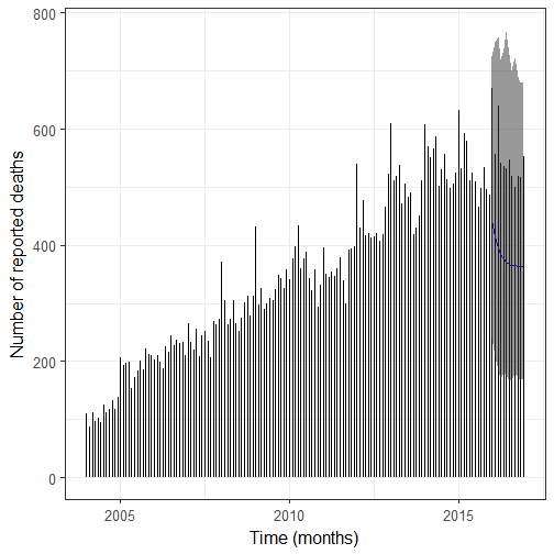 SEE THE UPDATE BELOW! 2017-02-14
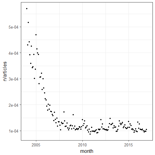
After discussing the model above with several people (including in the comments of the post, thanks Michael, and by email, thanks Tobias) and realizing I hadn’t checked the residual auto-correlation properly (shame on me!) I decided to re-do the model with an offset. Now tscount doesn’t support offsets yet so I resorted to glarma. I used the number of articles on Wikipedia as an offset and data from 2009 only because after 2009 the ratio of the number of notable deaths per month divided by the number of articles seemed more or less constant. I got the data on the number of articles from this really cool Wikipedia article. I quite lazily used the latest non missing number of Wikipedia articles as number of articles for each day and made an average for the month.
# not really a table so I copy pasted it
wikisize <- readr::read_csv("data/2017-02-14_wikisize.csv",
                            col_names = c("date", "articles_count", "comment"))
deaths <- deaths %>%
  group_by(date) %>%
  summarize(n_deaths = n())

deaths <- left_join(deaths, wikisize, by = "date")
# latest number of 2003
deaths$articles_count[1] <- 188538
deaths <- mutate(deaths,
                 articles_count = zoo::na.locf(articles_count))

monthly_deaths <- deaths  %>%
  group_by(date) %>%
  mutate(month = update(date, day = 1)) %>%
  ungroup() %>%
  group_by(month) %>%
  summarize(n = sum(n_deaths),
            articles = mean(articles_count))

ggplot(monthly_deaths) +
  geom_point(aes(month, n/articles))
library("glarma")
monthly_deaths <- filter(monthly_deaths,
                         year(month) > 2008)
ts_deaths <- xts::xts(monthly_deaths$n[1:84],
                      monthly_deaths$month[1:84])

ts_deaths = ts(ts_deaths, freq=12, start=c(2009, 1))
I then use a new model. For upper and lower bounds I used quantiles from the negative binomial distribution.
glarmamodOffset <- glarma(ts_deaths,
                          X = as.matrix(rep(1, 84)),
                          offset = log(monthly_deaths$articles[1:84]/100000),
                          phiLags = c(1, 12),
                          type = "NegBin", method = "FS",
                          residuals = "Pearson", maxit = 100, grad = 1e-6)

pred <- forecast(glarmamodOffset, n.ahead = 12,
                   newdata = as.matrix(rep(1, 12)),
                   newoffset = log(monthly_deaths$articles[85:96]/100000))

monthly_deaths <- mutate(monthly_deaths,
                         pred = NA, lower = NA, upper = NA)
monthly_deaths$pred[85:96] <- pred$Y
monthly_deaths$upper[85:96] <- qnbinom(0.975, mu = pred$Y, size = glarmamodOffset$delta[4])
monthly_deaths$lower[85:96] <- qnbinom(0.125, mu = pred$Y, size = glarmamodOffset$delta[4])
ggplot(monthly_deaths) +
  geom_segment(aes(x = month, xend = month,
                   y = 0, yend = n)) +
  ylab("Number of reported deaths") +
  xlab("Time (months)") +
  geom_line(aes(x = month, y = pred), col = "blue")+
  geom_ribbon(aes(x = month, ymin = lower, ymax = upper),
              alpha = 0.5)
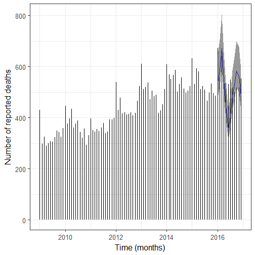
So what? First I’d say it’s important to check your model really well, maybe this one isn’t the best one but it’s already better than the previous one, and I’ll keep thinking about how to improve it but I already wanted to post a mea culpa! Now regarding my initial question, nearly all number of deaths of 2016 are below the 95% quantile of the negative binomial distribution (disregarding estimation uncertainty) which means that maybe 2016 wasn’t a bad year for notable deaths in general, but then one should make the same analysis on a subset of the data like notable dead from the arts by filtering them according to their role, or notable dead whose Wikipedia pages consistently had more than X% of total Wikipedia daily page views before their deaths. I’m actually planning on doing more with page views, but in the meantime, it was nice to play with time series of counts again!
I’d like to end this post with a note from my husband, who thinks having a blog makes me an influencer. If you too like Wikipedia, consider donating to the Wikimedia foundation.